Social Media Graphics vs Print Design: What’s the Difference?
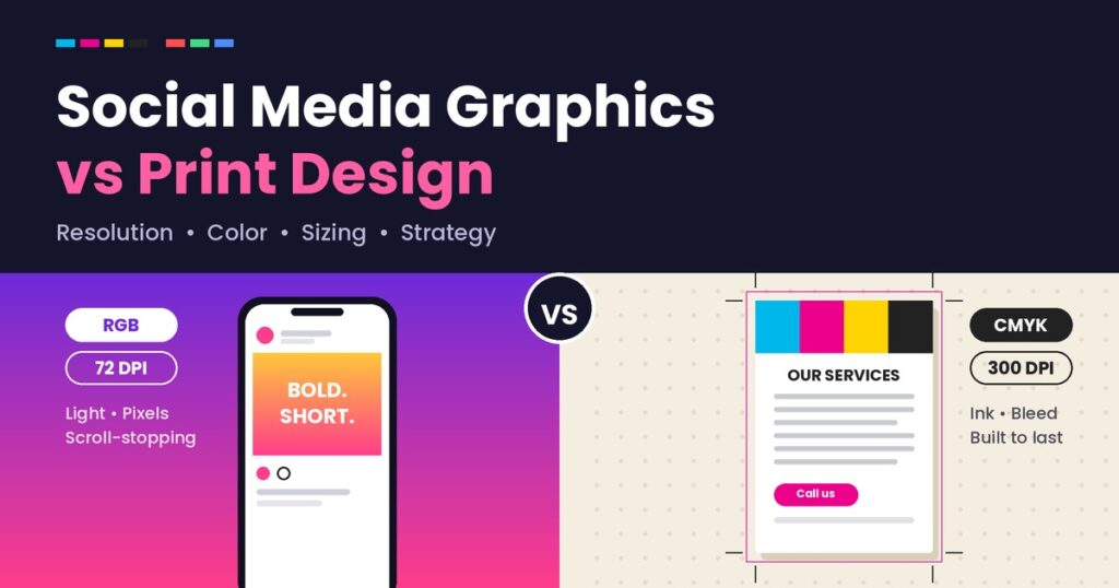
Social media graphics vs print design is a comparison every small business eventually runs into — usually the first time a beautiful Instagram post gets printed as a flyer and comes out blurry, oddly cropped, or with washed-out colors. The two mediums might look similar on a screen, but they operate under completely different technical rules, and confusing the two is one of the most common design mistakes small businesses make. Understanding the real differences between social media graphics vs print design isn’t just a technical detail for designers — it directly affects how professional your business looks in both digital and physical spaces. A poorly adapted print piece can undo the trust a polished Instagram feed builds, and vice versa. In this guide, we’ll break down exactly how these two design formats differ — in resolution, color, sizing, and strategy — so you know what to ask for (and what to avoid) the next time you commission either. Why Social Media Graphics vs Print Design Confusion Happens Most small business owners aren’t trained designers, and it’s a reasonable assumption that a “good design” should work everywhere once it’s made. In reality, a design created for one medium often breaks when moved to the other because of fundamental technical differences — resolution requirements, color systems, and even how people consume the content. This confusion usually surfaces in a few predictable ways: Each of these problems traces back to the core differences between social media graphics vs print design, which we’ll unpack below. Resolution: Screen vs Paper One of the biggest technical differences in social media graphics vs print design is resolution requirements. Social media graphics are typically designed at 72 DPI (dots per inch), which is standard for screens. Screens display images using light (RGB), and this resolution is more than sufficient for how images render on phones and computers. Print design, on the other hand, requires a minimum of 300 DPI to look sharp on paper. Paper doesn’t have the same forgiving nature as a backlit screen — any pixelation or low-resolution image becomes immediately obvious once printed, especially in large formats like banners or posters. Why this matters: A logo or graphic designed only for social media (72 DPI) will almost always look blurry or pixelated if used for a printed brochure, banner, or business card without being redesigned or recreated at a higher resolution. Color Systems: RGB vs CMYK This is one of the most overlooked differences in social media graphics vs print design, and it’s responsible for the classic “the colors looked different when I printed it” complaint. Screens use RGB (Red, Green, Blue) — a color system that uses light to create colors, capable of producing vibrant, glowing tones that don’t exist in physical ink. Printers use CMYK (Cyan, Magenta, Yellow, Black) — a color system that uses physical ink layered on paper. CMYK has a smaller color range than RGB, meaning some bright, neon, or glowing colors that look great on screen simply cannot be reproduced accurately in print. Why this matters: If your brand colors are chosen and approved only by looking at a screen, they may shift — sometimes noticeably — once printed. Designers who understand social media graphics vs print design differences will convert and adjust colors specifically for each medium rather than assuming one will translate perfectly to the other. Sizing and Dimensions Social media platforms each have their own specific size requirements — Instagram feed posts, Stories, Reels covers, Facebook covers, and LinkedIn banners all use different dimensions and aspect ratios. Designing without these exact specs in mind often results in awkward cropping or important text/logos being cut off. Print materials follow an entirely different set of standard sizes — business cards, A4 flyers, A5 brochures, banners, and posters each have established dimensions (often in inches or millimeters, not pixels) along with required “bleed” margins — extra space around the edges to account for trimming during the printing process. Why this matters: A graphic designed at social media dimensions will need to be recreated, not simply resized, to work correctly as a printed piece — and failing to account for bleed margins in print design can result in important content being cut off during trimming. Design Strategy: Scroll-Stopping vs Shelf-Life Beyond the technical differences, social media graphics vs print design also differ significantly in strategic purpose. Social media graphics are designed to stop a thumb mid-scroll. They typically use bold colors, short text, and eye-catching visuals optimized for a few seconds of attention on a small screen, often competing with dozens of other posts in a feed. Print design usually has a longer “shelf life” — a brochure might sit on a table for weeks, a business card might be kept in a wallet for months, and a banner might be viewed from a distance for an extended period. This changes the design approach: print pieces often include more detailed information, prioritize readability from a distance, and are built to hold attention rather than just capture it instantly. Why this matters: Applying social-media-style bold, minimal-text design to a print brochure can leave out information customers need. Conversely, applying dense, detail-heavy print-style design to social media often results in content that’s ignored while scrolling. When You Need Both (And How to Keep Them Consistent) Most small businesses eventually need both social media graphics and print design — an Instagram presence alongside business cards, flyers, or signage. The key isn’t choosing one over the other; it’s ensuring both are built from the same underlying brand system. Here’s how to keep social media graphics vs print design consistent despite their technical differences: 1. Start from one brand foundation Your colors, fonts, and overall visual style should originate from a single brand identity — even though the specific files and formats will differ between digital and print versions. 2. Request both digital and print-ready files upfront When commissioning any design work, ask your designer to provide both a 72 DPI RGB version for digital use and a 300 DPI CMYK version for